America?s Demographic Time Bomb
You can never underestimate the importance of demographics in shaping long term investment trends, so I thought I?d pass on these two highly instructive maps.
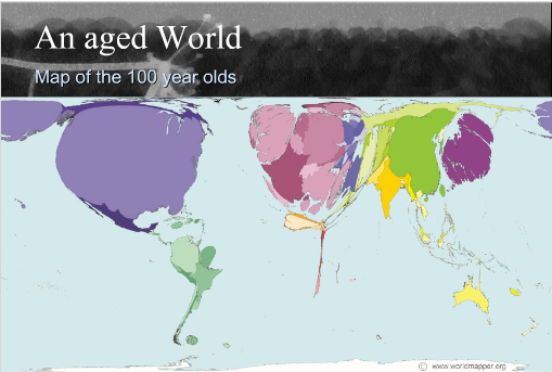
The first shows a map of the world drawn in terms of the population of children, while the second illustrates the globe in terms of its 100 year olds. Notice that China and India dominate the children?s map. Kids turn into consumers in 20 years, stay healthy for a long time, and power economic growth. The US, Japan, and Europe shrink to a fraction of their actual size on the children?s map, so economic growth is in a long term secular downtrend there.
There is more bad news for the developed world on the centenarian?s map, which show these countries ballooning in size to grotesque, unnatural proportions. This means higher social security and medical costs, plunging productivity, and falling GDP growth.
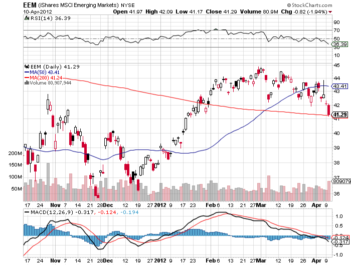
The bottom line is that you want to own equities and local currencies of emerging market countries, and avoid developed countries like the plague. This is why we saw tenfold returns from SOME emerging markets (EEM) over the past ten, and why there is an irresistible force pushing their currencies upward (CYB). Use any major melt downs this year to increase your exposure to emerging markets, as I will.

Would You Rather Own Them?
Or Them?


